You spent weeks perfecting your packaging design. The printed samples arrive with blurry images, off colors, and cut text. That disappointment wastes time and money. I help DTC brands avoid these exact problems.
Use AI, PSD, or CDR formats, keep images at 300 DPI, switch to CMYK, embed fonts or outline text, and add 3mm bleed with 5mm safe margins. These steps deliver sharp, color-accurate packaging on the first print run.
 Designer reviewing packaging artwork files
I have seen too many founders lose launch momentum because of simple file mistakes. Let me guide you through the most important areas so your custom packaging looks premium and professional every single time.
What File Format Should I Use for Custom Packaging Artwork?
Your team sends a JPEG. The printer rejects it and requests a different format. Days slip away while you fix it.
Submit files in AI (Adobe Illustrator), PSD (Adobe Photoshop), or CDR (CorelDRAW).[^1] These formats keep lines crisp and allow easy edits for accurate professional printing.[^2]
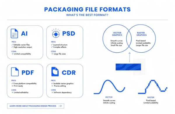 Vector file formats for packaging
I remember a cosmetics founder who came to me after a bad print. Their rigid boxes looked pixelated because they used PNG. We switched formats and fixed everything fast. Let me explain why this choice matters and how to handle it.
Why Vector Files Work Best
Vector files use math instead of pixels.[^3] Your logo stays sharp no matter the size.[^4] This is perfect for packaging that scales from small labels to large gift boxes. Raster files lose quality when enlarged.[^5]
When to Use Raster Images
Photos need raster format. Set them to at least 300 DPI.[^6] Anything lower creates fuzzy prints that hurt your premium image. I once reviewed files for a wellness brand where hero photos were only 72 DPI. We replaced them before production started.
File Format Recommendation Table
| Format | Best Use | Main Advantage | Watch Out For |
|---|---|---|---|
| AI | Logos and illustrations | Fully scalable | Requires Illustrator |
| PSD | Complex layered designs | Preserves layers | Larger file size |
| Final handover | Works everywhere | Limited editing | |
| CDR | CorelDRAW projects | Strong vectors | Less common software |
I always recommend AI when possible. It gives printers maximum flexibility. At Chocopackage we support all these formats and help you prepare them. We also handle special finishes like embossing and spot UV on folding cartons. Your designer can add these effects directly in the file. Clean layer names such as “Logo_Main” and “Background” make review faster. Test the file on another computer before you send it. This simple check catches most issues early. For cosmetics-personal-care projects, the right format protects your brand story and saves money on reprints.
Are Fonts Important in Packaging Artwork?
You pick a stylish font that matches your brand voice. The final printed box shows a completely different font.
Fonts are very important. Embed them in the file or convert text to outlines[^7] so the printer sees exactly your design without any substitution.
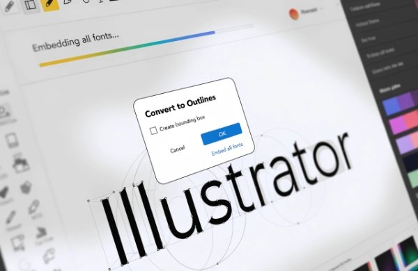 Font handling in packaging design software
A supplement client once lost their elegant script font during production. The replacement font made the package look cheap. We fixed it early. Here is how you can avoid the same problem.
Common Font Issues
Different computers have different fonts installed. Missing fonts cause automatic replacement.[^8] Your luxury feel disappears instantly. The solution is straightforward.
Simple Fixes That Work
In Illustrator use Type > Create Outlines. In Photoshop rasterize text layers after editing. Embedding keeps the font data inside the file for easy changes later.
Font Best Practices Table
| Action | How to Do It | Benefit to You |
|---|---|---|
| Choose licensed fonts | Buy or use free commercial ones | No legal problems |
| Convert to outlines | Select text and outline | No substitution |
| Embed fonts | Use export settings | Keeps editability |
| Limit fonts | Max 2-3 per design | Cleaner look |
| Test file | Open on different device | Catch errors fast |
Stick to two or three fonts maximum. One for headlines and one for body text. This rule works especially well for luxury-gift-packaging. In my experience font mistakes cause more re-prints than almost anything else. We provide free dielines that already include safe text zones. Your designer will thank you. I personally check font status on every file we receive.
RGB vs. CMYK – What’s the Difference?
Your monitor shows bright, vibrant colors. The printed samples look dull and flat.
RGB works for screens. CMYK works for print.[^9] Convert your design to CMYK before you send files so printed colors match your brand exactly.
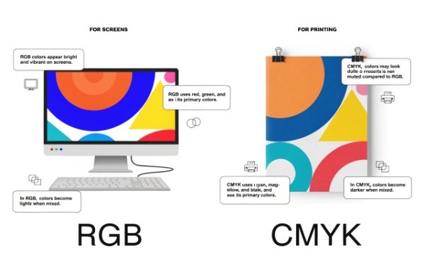 RGB versus CMYK color modes side by side
I help operations teams fix this issue weekly. One nutrition brand saw their signature green turn muddy brown. Proper conversion solved it. Let me break it down.
How These Modes Differ
RGB uses light. It creates bright colors perfect for websites. CMYK uses ink.[^10] It produces the colors you actually see on paper and packaging.
Why You Must Convert
RGB files printed directly lose vibrancy.[^11] Your premium positioning suffers. I use advanced color matching with ΔE < 1 at Chocopackage. But the file must start in CMYK.
Color Mode Comparison Table
| Feature | RGB | CMYK |
|---|---|---|
| Best for | Digital displays | Physical printing |
| Color result | Very bright | Accurate for ink |
| File size | Usually smaller | Slightly larger |
| Common mistake | Dull final prints | None if converted early |
| Recommendation | Use for mockups | Final artwork only |
Convert early in design. Keep an RGB copy for your website. We accept both and handle final adjustments when needed. This step is crucial for nutraceuticals-supplements where brand colors must stay consistent across every batch. Pantone spots for logos give even tighter control. Test prints through our 7-day rapid prototyping remove all guesswork.
Don’t Forget the Bleed Area
Text sits too close to the edge. After cutting some words disappear. The whole package looks unfinished.
Add 3mm bleed around all sides and keep important text and logos at least 5mm inside the cut line.[^12] This protects your design during production trimming.
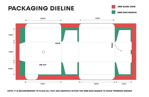 Bleed margin diagram for packaging
I learned this the hard way early on. A client forgot bleed on their pouches and we reprinted at our expense. Here is the simple system that works.
Bleed and Safe Margin Explained
Bleed lets your design extend past the final cut. Safe margins keep key elements away from edges. Use both together for clean results.
Setup Checklist
- Extend background colors into the bleed zone
- Place logos and text inside the 5mm safe area
- Use the manufacturer’s dieline
- Check at 400% zoom
- Include crop marks in export
For e-commerce-retail-shipping mailers these measurements are especially important. We send free dielines with bleed and safe zones already marked. Designers simply fill the layers. I review every file for compliance before production. This attention to detail separates average packaging from packaging customers remember and photograph.
What If My Designer Doesn’t Know Packaging Structure?
Your designer creates beautiful flat artwork. When folded the seams look wrong or text gets hidden.
Ask the manufacturer for official dielines if your designer is new to packaging. Free templates and guidance make the process easy.
Many creative directors feel stuck on structure. I bridge that gap every week.
Why Structure Knowledge Helps
Flat art ignores folds, glue tabs, and assembly. Wrong placement creates visible problems. Correct dielines prevent them.
Our Support Process Table
| Step | Responsibility | Result |
|---|---|---|
| 1 | Request dieline | Accurate base file |
| 2 | Designer adds art | Perfect alignment |
| 3 | We review | Errors caught early |
| 4 | Rapid prototype | Real sample in hand |
| 5 | Final approval | Smooth production |
Last month I guided a team through their first structural project. The final stand-up-pouches looked fantastic. Low MOQs let them test safely. We also support paper-tubes-composite-cans. Collaboration like this turns good ideas into great packaging.
File Too Large to Email? Here’s What to Do:
Your large design file bounces back from email. Deadlines get tight.
Upload to Google Drive, Dropbox, or WeTransfer and send a secure link. These tools handle big files without problems.
 Cloud file sharing for large packaging files
I receive multi-hundred-megabyte files daily. Email limits create extra stress.
Easy Sharing Options
WeTransfer is fast for one-time delivery. Dropbox gives version history. Google Drive allows comments. All keep your files safe.
Quick Tips Before Sending
Name files with date and version. Add a simple PDF proof. Compress non-essential layers. Clear notes about finishes help us review faster.
Conclusion
Good file preparation saves time and delivers the premium unboxing your customers expect. Follow these steps and your packaging will print perfectly.
��️ Why Partner With Chocopackage for Your Next Project?
As the Strategic Packaging Partner for Scaling Premium DTC Brands, Chocopackage turns high-growth visions into reality for skincare, supplements, wellness, and luxury brands. Whether you are a startup testing ideas or an established leader expanding, we deliver:
- ✨ Premium rigid boxes, folding cartons, stand-up pouches & custom labels
- 🛠️ Free structural design, dielines & 7-day rapid prototyping
- ✅ Ultra-low MOQs from 500–1,000 pcs to protect your cash flow
- 🌍 Reliable door-to-door DDP global shipping
- 💬 Clear English support and a dedicated project manager
�� Need a second pair of eyes on your artwork or help with a dieline?
Send it my way — I will personally check the file and walk you through every step.
- 🌐 Website: https://chocopackage.com/
- ✉️ Email: lily@chocopackage.com
- 📱 Call / WhatsApp: +86 134 5929 7861
[^1]: "Artwork Specifications - Document Solutions", https://documentsolutions.utexas.edu/printing/artwork-specifications. Prepress guidance from educational or standards-based sources describes native layered/vector formats and press-ready PDF workflows as common ways to preserve editability and production information before printing. Evidence role: general_support; source type: education. Supports: AI, PSD, and CDR are suitable file formats for submitting custom packaging artwork to professional printers.. Scope note: Support is likely to be contextual because accepted file formats vary by printer, workflow, and software environment.
[^2]: "Art Preparation Guidelines | Princeton University Press", https://press.princeton.edu/resources/art-preparation-guidelines?srsltid=AfmBOoovaEHVlM3r2n_Hb8BedgBnGUixhCFKhLHfYX-NVhXVSE9yLtX6. Prepress and graphic-technology sources explain that vector or layered native artwork can preserve sharp edges and editable elements better than flattened bitmap submissions in many print-production workflows. Evidence role: mechanism; source type: education. Supports: AI, PSD, and CDR formats help preserve crisp line work and editability for professional printing.. Scope note: This supports the general mechanism; actual print accuracy also depends on export settings, RIP processing, proofing, and printer specifications.
[^3]: "Vector graphics - Wikipedia", https://en.wikipedia.org/wiki/Vector_graphics. Reference sources define vector graphics as images described by mathematical paths or geometric primitives rather than by a fixed grid of pixels. Evidence role: definition; source type: encyclopedia. Supports: Vector files are based on mathematical descriptions rather than pixels..
[^4]: "Image scaling - Wikipedia", https://en.wikipedia.org/wiki/Image_scaling. Technical references on vector graphics state that mathematically defined shapes can be scaled without the resolution loss associated with raster images. Evidence role: mechanism; source type: encyclopedia. Supports: Vector logos can remain sharp when scaled to different sizes.. Scope note: This applies to vector elements; embedded raster images inside a vector file may still lose quality when enlarged.
[^5]: "Raster vs. Vector Images - All About Images - Research Guides", https://guides.lib.umich.edu/c.php?g=282942&p=1885352. Digital imaging sources explain that raster images have a fixed pixel resolution, so enlarging them can reveal pixelation or interpolation artifacts. Evidence role: mechanism; source type: education. Supports: Raster files can lose visible quality when enlarged.. Scope note: The visible quality loss depends on the original resolution, enlargement amount, viewing distance, and resampling method.
[^6]: "[PDF] What Resolution Should Your Images Be?", https://cft.vanderbilt.edu/wp-content/uploads/sites/59/Image_resolutions.pdf. Printing and imaging guidance commonly uses 300 pixels per inch as a practical target resolution for high-quality reproduction of continuous-tone images at final print size. Evidence role: expert_consensus; source type: education. Supports: Raster photos intended for print are commonly prepared at about 300 DPI/PPI at final size.. Scope note: The required resolution can vary by printing method, screen ruling, substrate, image content, and viewing distance.
[^7]: "Font Embedding vs. Outlining - Ewan Printing", https://ewanprinting.com/2025/07/04/font-embedding-vs-outlining/. Prepress guidance explains that embedding fonts or converting text to outlines preserves the intended letterforms when the receiving system does not have the original fonts installed. Evidence role: mechanism; source type: education. Supports: Embedding fonts or outlining text helps prevent unintended font changes in print files.. Scope note: Outlining text can reduce editability and may affect hinting or accessibility; embedding may be restricted by font licensing permissions.
[^8]: "Replace missing fonts - Adobe Help Center", https://helpx.adobe.com/photoshop/desktop/text-typography/select-manage-fonts/replace-missing-fonts.html. Software documentation and prepress guidance note that when a document references fonts unavailable on the output system, applications may substitute another font or flag the font as missing. Evidence role: mechanism; source type: institution. Supports: Missing fonts can lead to font substitution in production files.. Scope note: Exact behavior differs by application, operating system, and file format; some workflows stop output rather than substitute fonts automatically.
[^9]: "RGB color model - Wikipedia", https://en.wikipedia.org/wiki/RGB_color_model. Color-science and printing references distinguish additive RGB color used by light-emitting displays from subtractive CMYK color used in ink-based printing processes. Evidence role: definition; source type: encyclopedia. Supports: RGB is primarily a display color model, while CMYK is primarily a print color model.. Scope note: Some modern print workflows accept RGB files and perform managed conversion, but CMYK remains the conventional process-color model for many press outputs.
[^10]: "Additive & Subtractive Color Models > DINFOS Pavilion > Article", https://pavilion.dinfos.edu/Article/Article/2355687/additive-subtractive-color-models/. Authoritative color references describe RGB as an additive model based on emitted red, green, and blue light and CMYK as a subtractive model based on cyan, magenta, yellow, and black inks. Evidence role: mechanism; source type: encyclopedia. Supports: RGB is light-based and CMYK is ink-based.. Scope note: The statement that RGB is “perfect for websites” is practical design guidance rather than a scientific property; evidence mainly supports the underlying color-model distinction.
[^11]: "Color - Wikipedia", https://en.wikipedia.org/wiki/Color. Color-management sources explain that RGB and CMYK have different color gamuts, and colors visible on a display may be outside the reproducible gamut of process printing, requiring conversion or gamut mapping. Evidence role: mechanism; source type: education. Supports: Printing RGB artwork without proper color management can produce less vibrant or shifted colors because screen and print gamuts differ.. Scope note: Not all RGB-to-print conversions produce visibly dull results; outcomes depend on profiles, rendering intent, printer gamut, ink set, and substrate.
[^12]: "Set up Bleed and Margins For Quality Printing - Adobe Illustrator", https://www.gogoprint.sg/blog/artwork-essentials/set-up-bleed-and-margins-in-adobe-illustrator-sg/?srsltid=AfmBOooQkQu5GQRd2mS_PwCM4XdWiRqvZPZAsfb__kW6kuco2M3sjnzl. Print-production guidance commonly recommends adding bleed beyond the trim edge and keeping important content inside a safety margin to accommodate normal cutting and finishing variation. Evidence role: expert_consensus; source type: education. Supports: Bleed and safety margins help protect packaging artwork from trimming variation, with 3 mm bleed and 5 mm safe margins used as common specifications.. Scope note: The exact 3 mm bleed and 5 mm safety values are common specifications but may differ by printer, packaging structure, cutting equipment, and substrate.