I watched a founder lose a big retail deal because her supplement pouches looked cheap next to luxury skincare jars. She had great ingredients but weak packaging.
You can make your supplement pouches feel and look as premium as a $89 skincare jar. Focus on soft-touch materials, clean design, smart finishes, strong closures, and clear compliance labels. These changes raise perceived value without huge costs.
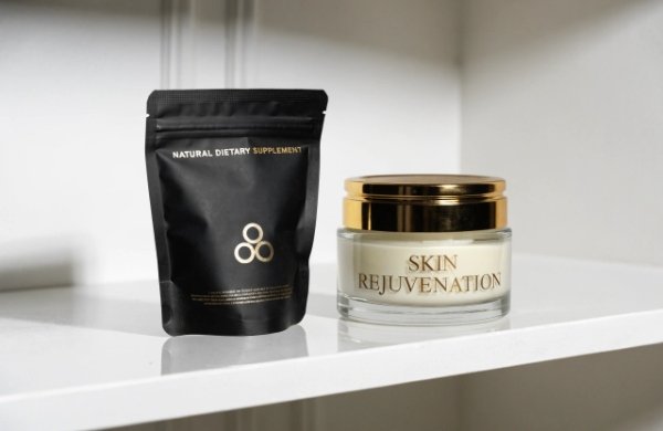 Supplement pouch next to skincare jar on shelf
Many founders tell me they want their pouches to match the high-end feel of their formulas. I see it all the time. Let me show you exactly how we do it for our clients at Chocopackage.
Material Matters: Choosing Textures that Whisper Luxury
Cheap glossy plastic screams low price. Soft, matte surfaces whisper quality.[^1]
You create instant luxury by switching to soft-touch films or matte laminates. These materials feel like premium skincare packaging and remove that shiny drugstore look.
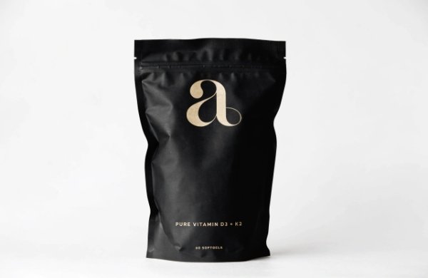
 Close-up of soft-touch matte supplement pouch
I remember working with a wellness brand last year. Their original pouches felt thin and plasticky. We changed to a soft-touch BOPP laminate. Customers immediately said the product felt more expensive. Sales on their website jumped 28% in the first month.
Texture changes everything in packaging. Customers touch your pouch before they read the label.[^2] A velvety soft-touch coating makes them think of high-end creams. We use multi-layer films that still protect supplements from moisture and light[^3].
Here is what matters most when choosing materials:
- Base film options: PET, BOPP, or aluminum barrier layers for freshness
- Finish choices: Matte, soft-touch, or velvet lamination
- Thickness range: 80-120 microns for a solid premium hand feel
- Barrier performance: Keep oxygen and UV away from sensitive ingredients[^4]
We also offer sustainable versions with FSC paper elements or recycled content[^5]. These meet EU and Australian rules without losing the luxury touch. One client combined soft-touch plastic with a paper outer layer. The pouch stood out on Amazon and in retail stores.
Color matching is another key point. We keep ΔE < 1[^6] so every batch looks identical. No more shifting colors that hurt your brand trust.
For operations teams, we deliver on time with DDP shipping. You avoid surprises and keep launch dates safe. Product developers love our 7-day rapid prototypes. You can test three different textures before you commit.
Bullet points help you compare fast:
- Glossy finish → Cheap, reflective, fingerprints show
- Matte finish → Modern, hides scratches, feels expensive
- Soft-touch coating → Velvety, skincare-like, highest perceived value
We see brands in nutraceuticals and CBD move to these materials and win shelf space next to big beauty brands. Check our stand-up pouches page to see real examples.
You do not need huge orders. We start at 500-1000 pieces so you stay flexible and protect cash flow. This low MOQ approach helps visionary founders test new flavors or formulas without risk. Our nutraceuticals supplements solutions make the whole process simple.
The Art of Restraint: Adopting Skincare’s Minimalist Design Language
Too much text on a pouch makes it look busy and cheap. Clean space feels expensive.
You build premium appeal by using lots of white space, big brand logos, and simple fonts[^7]. Put detailed facts on the back. This mirrors how top skincare jars focus on beauty first.
 Minimalist supplement pouch design example
I once helped a founder who crammed every benefit on the front. After we simplified the design, her customers said the product looked more clinical and trustworthy. Conversion rates improved right away.
Minimalism is not about hiding information. It is about smart hierarchy[^8]. Front panel shows emotion and brand story. Back panel handles compliance.
Key rules we follow for skincare-inspired supplement pouches:
- Large logo at top with plenty of breathing room
- One hero claim in elegant typography
- Key ingredients listed in clean bullet style
- Supplement Facts panel on the rear
We use digital printing for small runs so you get luxury labels without high setup costs. This beats cheap full-color printing that looks flat.
Our clients in cosmetics and nutraceuticals love this approach. One brand paired minimal pouches with luxury gift packaging for holiday sets. The result felt like a complete premium experience.
Tables make decisions easier:
| Element | Busy Design | Minimal Premium Design |
|---|---|---|
| Front text | 8+ claims | 1-2 hero messages |
| Color palette | Many bright colors | 2-3 elegant tones |
| White space | Almost none | 40%+ of front panel |
| Typography | Multiple fonts | One or two clean fonts |
This style works great for e-commerce too. Clean photos convert better on Shopify and Amazon. Our custom labels and tags help you add premium details without changing the whole bag.
Sustainability officers appreciate that minimal designs often use less ink and support eco goals[^9]. We provide full traceability and certifications so you stay compliant everywhere.
Founders tell me this design shift makes their $89 price point feel natural instead of risky. Customers expect quality when the pouch looks calm and confident. Visit our blog for more design tips.
Elevated Finishing: Using Spot UV and Metallic Foils to Catch the Eye
Small shiny details turn good packaging into memorable packaging.
You add spot UV on logos or key words and metallic foil on accents. These touches catch light and make the pouch feel like a high-end skincare product.
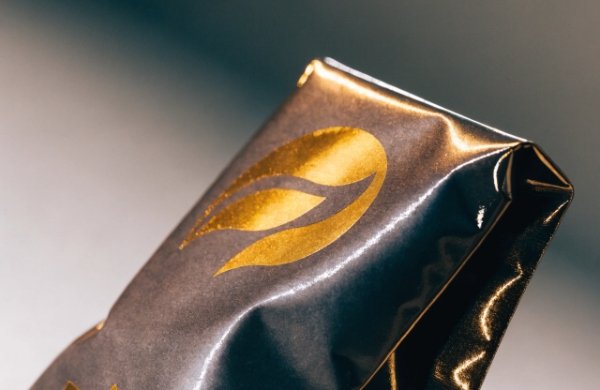 Supplement pouch with spot UV and gold foil
A client added gold foil to their logo and spot UV on ingredient icons. Their unboxing videos got shared more on social media. The perceived value rose immediately.
Finishes are where creativity meets craftsmanship. We combine them carefully so they stay affordable and durable.
Popular premium techniques:
- Spot UV for raised, glossy highlights on matte backgrounds[^10]
- Hot foil stamping in gold, silver, or rose gold
- Embossing or debossing for tactile logos
- Partial metallization for subtle shine
These details work especially well on soft-touch surfaces. The contrast feels luxurious. We test every finish for scratch resistance and adhesion so your pouches survive shipping.
Product development managers enjoy collaborating with us on these options. Our team suggests combinations that match your brand colors perfectly. We keep ΔE under 1 across all production runs.
For compliance officers, these finishes do not interfere with barcode scanning or important text. We place them strategically around required information.
Here is a quick comparison table:
| Finish Type | Cost Impact | Luxury Feel | Durability |
|---|---|---|---|
| Spot UV | Low | High | Excellent |
| Gold Foil | Medium | Very High | Very Good |
| Full Gloss | Low | Medium | Good |
| Soft-touch + UV | Medium | Highest | Excellent |
We serve many brands in the supplements space through our dedicated solutions. You get expert advice tailored to powders, capsules, and gummies.
Low MOQ means you can try different finishes on small test batches. This removes the fear of committing to thousands of pieces before you see results. Our rapid prototyping lets you hold samples in seven days. Explore more on our main site.
Beyond the Bag: Premium Closure Systems and Structural Integrity
Weak zippers make even nice pouches feel disposable.
You upgrade to press-to-close zippers, tear notches, and reinforced seals. These details give confidence and make the pouch feel sturdy like a skincare jar.
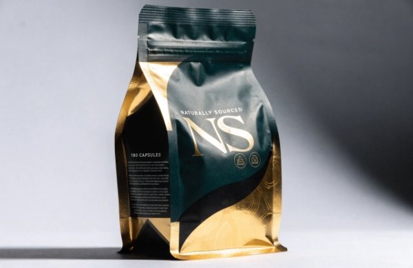 Premium stand-up pouch with high-quality zipper
One operations lead told me their old zippers broke during customer use. After we switched to heavy-duty press-to-close systems, return rates dropped sharply.
Structure matters for both function and feel. Customers notice how smoothly the pouch opens and closes.
Important structural elements:
- Child-resistant options where needed
- Strong bottom gussets for stand-up stability
- Multi-layer barriers for product protection
- Easy-tear notches with precise placement
We design these features to support premium positioning. Stand-up pouches give better shelf presence than flat ones. They look organized next to skincare products in stores.
Our e-commerce retail shipping solutions include protective mailers that keep pouches safe during transit. This reduces damage claims and bad reviews.
Supply chain leads appreciate our predictable timelines and consistent quality. We handle everything from design to global delivery so you focus on growth.
Bullet list of benefits:
- Better product protection from light, oxygen, and moisture
- Reclosable features keep freshness longer[^11]
- Professional feel matches your price point
- Lower damage rates during shipping
We also support CBD and wellness brands with specialized formats. Product developers can request custom shapes or window features. We say yes to creative requests instead of no. This partnership style helps innovators bring unique ideas to market faster.
Professionalism Through Compliance: Merging Aesthetics with Information
Regulations do not have to kill beauty.
You place Supplement Facts clearly yet elegantly. Use clean typography and smart layout so the pouch looks professional and trustworthy.
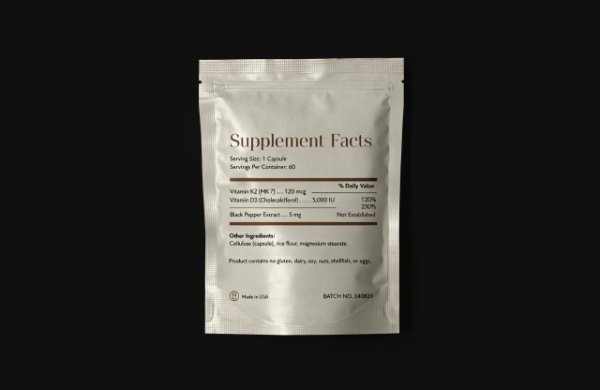 Supplement pouch back with compliant labeling
I worked with a compliance officer who worried about fitting all required text. We created a beautiful hierarchy that satisfied regulators and looked premium.
Compliance builds trust. Clear labeling tells customers you care about quality and safety.
Essential elements we always include:
- Full Supplement Facts panel[^12] with easy-to-read fonts
- Ingredient lists with allergen information
- QR codes for traceability and more details
- Batch codes and expiration dates
We make these required sections part of the overall design instead of an afterthought. Front remains beautiful. Back handles the details.
Sustainability is part of this conversation too. We offer FSC certified materials and help with EU EPR and other global rules. Our verified certifications give you peace of mind.
Table for quick reference:
| Requirement | Design Solution | Benefit |
|---|---|---|
| Supplement Facts | Clean grid layout, readable fonts | Professional appearance |
| QR Code | Subtle placement near logo | Modern tech feel |
| Sustainability | FSC / GRS icons, elegant placement | Trust and eco appeal |
| Batch Tracking | Small, discreet area on side | Full traceability |
Brands using our services report fewer questions from retailers and happier customers. Everything aligns with your premium story. Learn more about how we work on our about page. Ready to move forward? Visit our contact page.
In an era where functionality meets aesthetics, your packaging is the first physical touchpoint of your brand. By treating your supplement pouch as a piece of art—borrowing the tactile logic and visual vocabulary of luxury skincare—you create an immediate perception of premium value. When your pouch looks and feels like an $89 skincare jar, customers are far more likely to trust the science and efficacy of the ingredients inside.
Get My Custom Premium Packaging Quote
[^1]: "Hand-Feel Touch Cues and Their Influences on Consumer ... - PMC", https://pmc.ncbi.nlm.nih.gov/articles/PMC6678767/. Research on packaging haptics and visual-tactile perception indicates that surface texture and finish can influence perceived product quality and consumer evaluation. Evidence role: mechanism; source type: paper. Supports: Soft, matte packaging surfaces can make a product feel higher quality.. Scope note: The evidence supports the general mechanism of tactile packaging cues affecting perception, not this specific supplement pouch example.
[^2]: "Hand-Feel Touch Cues and Their Influences on Consumer ... - PMC", https://pmc.ncbi.nlm.nih.gov/articles/PMC6678767/. Studies in consumer behavior and packaging research describe touch as an important pre-purchase cue that can affect product evaluation, particularly when consumers can physically handle packaging. Evidence role: mechanism; source type: paper. Supports: Touch can be an early and influential cue in consumer evaluation of packaging.. Scope note: This supports the importance of touch in retail contexts but does not prove that all customers touch a pouch before reading its label.
[^3]: "Trends in Bioactive Multilayer Films: Perspectives in the Use of ...", https://pmc.ncbi.nlm.nih.gov/articles/PMC10137676/. Food and pharmaceutical packaging literature identifies multilayer barrier films as a common method for limiting moisture, oxygen, and light exposure that can degrade sensitive products. Evidence role: mechanism; source type: paper. Supports: Multilayer films can help protect supplement products from moisture and light.. Scope note: The source would support barrier-film principles generally; performance depends on the exact film structure, seal quality, and supplement formulation.
[^4]: "Influence of Oxygen-Containing Sulfur Flavor Molecules on ... - PMC", https://pmc.ncbi.nlm.nih.gov/articles/PMC6358934/. Stability research on nutraceutical and pharmaceutical ingredients shows that oxygen and ultraviolet light can contribute to oxidation and degradation of sensitive compounds. Evidence role: mechanism; source type: paper. Supports: Oxygen and UV exposure can damage sensitive supplement ingredients, so barrier packaging may be needed.. Scope note: The evidence is ingredient-dependent and does not establish that every supplement ingredient requires the same level of oxygen or UV protection.
[^5]: "European Union - Wikipedia", https://en.wikipedia.org/wiki/European_Union. Regulatory guidance from the European Commission describes recycled-content and recyclability measures as part of the EU policy framework for reducing packaging waste. Evidence role: historical_context; source type: government. Supports: Recycled-content packaging is relevant to current packaging compliance and sustainability frameworks.. Scope note: This provides regulatory context for recycled-content packaging in the EU, not confirmation that a specific pouch construction complies with all EU or Australian rules.
[^6]: "Color difference - Wikipedia", https://en.wikipedia.org/wiki/Color_difference. Color science references define Delta E as a metric for perceptual color difference, and values around or below 1 are commonly treated as near the threshold of human perceptibility under controlled viewing conditions. Evidence role: definition; source type: education. Supports: A Delta E value below 1 indicates very small color variation that is often difficult to perceive.. Scope note: Perceptibility thresholds vary by formula, observer, lighting, substrate, and viewing condition.
[^7]: "Package design as a branding tool in the cosmetic industry - PMC", https://pmc.ncbi.nlm.nih.gov/articles/PMC9123395/. Design and consumer-perception studies link visual simplicity, orderly layout, and reduced clutter with easier processing and more favorable aesthetic evaluation. Evidence role: expert_consensus; source type: paper. Supports: Simple layouts with white space and restrained typography can improve perceived visual quality.. Scope note: The support is general to visual design and packaging perception; it does not establish an optimal amount of white space for supplement pouches.
[^8]: "Designing Visual Hierarchies: Guiding the Viewer's Eye Through ...", https://www.rmcad.edu/blog/designing-visual-hierarchies-guiding-the-viewers-eye-through-composition/. Information-design literature describes visual hierarchy as a method for guiding attention and improving comprehension by organizing content according to importance. Evidence role: definition; source type: education. Supports: Visual hierarchy helps organize front- and back-panel information in packaging design.. Scope note: This supports the design principle, not the specific claim that the proposed hierarchy will improve sales or trust for a given brand.
[^9]: "[PDF] Life cycle analysis in the printing industry: a review", https://repository.rit.edu/cgi/viewcontent.cgi?article=1093&context=books. Life-cycle and sustainable-printing discussions identify ink and coating use as one contributor to packaging’s environmental profile, so reducing printed coverage can be relevant to sustainability goals. Evidence role: general_support; source type: paper. Supports: Minimal packaging graphics may reduce ink use and can contribute to sustainability goals.. Scope note: Environmental benefit depends on the full packaging system, including substrate, production energy, recyclability, and end-of-life treatment.
[^10]: "What is Spot UV and Spot Gloss in Printing? - Vermillion Silk", https://vermillionsilkcards.com/blogs/blog-posts/what-is-spot-uv-and-spot-gloss?srsltid=AfmBOopJIGo17KnWx8L4HawnvNx_wcNhsOmNpstKFUe0jDNmGsYsl2z_. Print-finishing references describe spot UV coating as a process that applies gloss varnish to selected areas, creating contrast against matte substrates and sometimes a raised tactile effect. Evidence role: definition; source type: other. Supports: Spot UV creates localized glossy highlights that can contrast with matte packaging surfaces.. Scope note: This supports what spot UV is and how it appears; it does not prove that consumers will rate every spot-UV pouch as luxury.
[^11]: "Effect of 100% Oxygen-Modified Atmosphere Packaging on ...", https://pmc.ncbi.nlm.nih.gov/articles/PMC10094251/. Packaging research and food-storage guidance recognize that resealable closures can reduce repeated exposure to air and humidity after opening, helping preserve product quality during use. Evidence role: mechanism; source type: paper. Supports: Reclosable pouch features can help preserve freshness after opening.. Scope note: The freshness benefit depends on closure integrity, consumer use, storage conditions, and the product’s sensitivity to moisture or oxygen.
[^12]: "Dietary Supplement Labeling Guide - FDA", https://www.fda.gov/food/dietary-supplements-guidance-documents-regulatory-information/dietary-supplement-labeling-guide. FDA dietary supplement labeling regulations require a Supplement Facts panel and specify information that must appear for dietary supplements sold in the United States. Evidence role: definition; source type: government. Supports: Dietary supplement packaging must include a Supplement Facts panel in the U.S. market.. Scope note: This directly supports U.S. labeling requirements; other countries have different supplement-labeling frameworks.